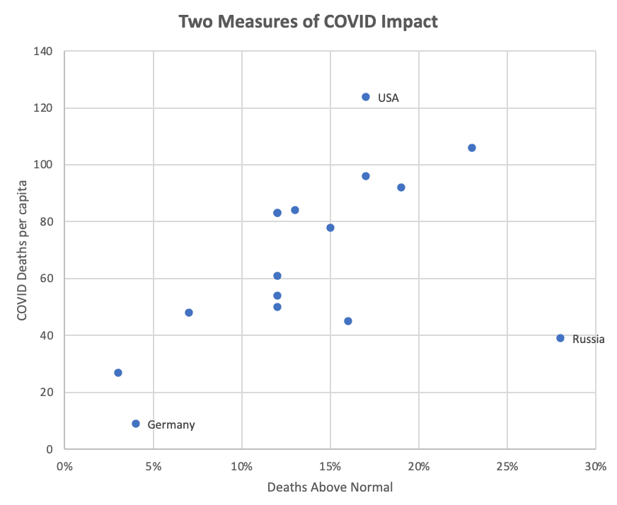
The New York Times published a chart showing the number of reported COVID-19 deaths per capita and deaths above normal this year for selected countries. My graph demonstrates that the two variables correlate quite well–except in Russia. That is circumstantial evidence that Russia (and only Russia, among these countries) is failing to report COVID-19 deaths, as Anton Troianovski suggests in the reported article.

I wanted to check this correlation because I am interested in what explains the very large differences in national death rates. An explanation is not at all obvious. Consider these statistics:
| country | deaths Above Normal | COVID-19 DEAThs per 100k | Social Welfare Spending (%GDP) | Health Care Spending Per Capita (PPP $US) | Pop Density / Square KM | Urban Pop. % | Median Age | Index of Stringency of COVID-19 regulations |
|---|---|---|---|---|---|---|---|---|
| Russia | 28% | 39 | 14% | $ 1,488.00 | 9 | 75% | 40.3 | 36.57 |
| Spain | 23% | 106 | 25% | $ 3,576.00 | 92 | 81% | 43.9 | 69.44 |
| Italy | 19% | 92 | 28% | $ 3,624.00 | 200 | 71% | 46.5 | 80.56 |
| U.K. | 17% | 124 | 21% | $ 4,619.00 | 281 | 84% | 40.6 | 75.93 |
| U.S. | 17% | 96 | 19% | $ 10,623.00 | 36 | 82% | 38.5 | 58.8 |
| Poland | 16% | 45 | 21% | $ 2,015.00 | 121 | 60% | 41.9 | 75 |
| Czech Rep. | 15% | 78 | 19% | $ 3,040.00 | 136 | 74% | 43.3 | 81.48 |
| Switzerland | 13% | 84 | 17% | $ 8,113.00 | 211 | 74% | 42.7 | 60.19 |
| Sweden | 12% | 83 | 25% | $ 5,828.00 | 23 | 88% | 41.1 | 69.44 |
| France | 12% | 83 | 31% | $ 5,250.00 | 119 | 81% | 41.7 | 78.8 |
| Netherlands | 12% | 61 | 16% | $ 5,634.00 | 410 | 92% | 42.8 | 75 |
| Portugal | 12% | 54 | 23% | $ 3,242.00 | 110 | 66% | 44.6 | 65.74 |
| Austria | 12% | 50 | 27% | $ 5,879.00 | 108 | 59% | 44.5 | 81.48 |
| Hungary | 7% | 48 | 18% | $ 2,115.00 | 104 | 72% | 43.6 | 79.63 |
| Finland | 4% | 9 | 29% | $ 4,457.00 | 16 | 88% | 42.8 | 52.31 |
| Germany | 3% | 27 | 26% | $ 6,098.00 | 235 | 77$ | 47.8 | 75 |
| Sources | New York Times | New York Times | OECD | WHO | World Population Review | World Bank | CIA World Fact Book | This Oxford tracker. |
The first point you may notice is a very high variation in many of these indicators. The excess death rate is 20 percentage-points worse in Spain than Germany. The UK has lost almost 14 times more people per capita to COVID-19 than Finland. France spends almost twice as much of its GDP on social welfare as the nearby Netherlands. Germany is 26 times more dense than Russia. Sweden is far more urban than Austria. Americans spend an average of five times more on healthcare than Hungarians. The only column with a small range is age expectancy.
The second point is that none of these variables correlates impressively with COVID-19 deaths. In a simple OLS regression, nothing comes anywhere near statistical significance.
It far from obvious why some countries have fared so much better or worse than the others. This is a smallish sample of countries (the only ones for which the NYT presented excess deaths) and maybe patterns would emerge in a larger sample. However, the situation seems noisy because so many variables may matter, and they can push in different directions in the same country.
For instance, Anne Applebaum recently wrote, “if the United States is very, very bad at social trust and public-health systems, it is very, very good at large-scale logistics.” I would gloss her second point this way: once the US government pays big companies a lot of money to do something, we often see impressive results. In this case, firms like Pfizer, FedEx, and CVS are administering millions of doses of vaccine per day with federal support. Yet we do a relatively bad job at changing behavior en masse because we tend to be distrustful and hyper-individualistic. The shifting performance of the US compared to other countries probably reflects these cross-pressures–and every other country has its own mix.
