- Facebook162
- Threads
- Bluesky
- Total 162
This is a systems map for k-12 civic education, developed for the CivXNow coalition and intended to guide the coalition and its members and allies. You can explore it here and also drill down to a more complex underlying map here.
[Suggested citation: Peter Levine, Louise Dubé, and Sarah Shugars, “Civic Education Systems Map,” Medford, MA: Jonathan M. Tisch College of Civic Life/CivXNow Coalition, 2018]
Why use systems-mapping to analyze an issue and guide a coalition?
Any coalition needs a strategy, and it must be …
- Sufficiently complex for the issue: There is rarely one root cause or one leverage point. Many factors matter, and some outcomes are also inputs or causes.
- Supported by the grassroots, not just organizational leaders: Members of the coalition’s organizations must support the plan and believe that people like them had a voice. It can’t just be designed by the apex leaders.
- Broadly engaging: There must be roles for many different kinds of organizations and people to play. It can’t be limited to levers that only a few groups can pull.
- Widely supported: It must win a degree of consensus. Majority support isn’t good enough. If substantial portions of the coalition disagree with the plan, they will peel away. They may not quit or complain, but they will refrain from actively supporting the coalition.
… but also …
- Coherent and concise: The plan can’t just be a list of what everyone already favors.
Traditional methods for accomplishing these goals included electing a steering committee who would draft a document and ask for a vote of organizations or their representatives. These methods never worked all that well and they seem obsolete now.
Building on network science, 100Kin10’s approach to mapping the Grand Challenges of the STEM teacher shortage, and other experiments (like those of the Democracy Fund), we invited more than 7,500 people to co-produce this system map for k-12 civic education. I believe the result meets the five criteria listed above.
Importantly, people were not asked to rank issues by importance or to vote on priorities. Instead, they were asked very specific analytical questions based on their experience of the world around them. From their answers, we derived a systems map that suggests high leverage points.
Although we originally asked about civic education in an open-ended way, it’s clear that most respondents were focused on the k-12 age range and on schools as venues. This means that the map is not about youth civic engagement in communities and social movements; the formal political system (voting rights, gerrymandering, campaigns); news and social media; higher education; or education beyond civics (e.g., who attends what kinds of schools).
I regard this focus as a strength. K-12 civics is a system that relates to other systems. Mapping everything is impossible and a distracting ideal. If your own focus is a neighbor of k-12 civics–say, youth organizing, or engagement in higher education–then this map may help you see how to connect to k-12 civics.
How to read the map
The circles or nodes represent circumstances that we should work to accomplish. You could think of them as goals. An arrow connects two circles if improving the first would help improve the second. Larger nodes have more connections. Larger arrows suggest that the causal connections are stronger or clearer. Click on any node to read more about it. Hover over any node or arrow to see its immediate neighbors.
Each node combines more specific components, and those are displayed on the more complex map.
The whole point of a systems map is to avoid a simple distinction between inputs and outputs, causes and effects. Effects tend to influence causes. However, it would be reasonable to read the main map as basically flowing downward from the key leverage points, via intermediaries, to the widely-shared goals of youth civic knowledge and youth civic engagement.
Findings and how to use the map
The components that are furthest upstream and may have the most influence–without themselves being influenced by many factors shown on the map–include the public’s commitment to civics and schools’ embrace of their civic missions, the degree to which civics is relevant and engaging, and policies at the state and federal level that require and/or assess civics.
Factors that are midstream–being affected by other factors and directly boosting youth outcomes–include professional development, engaging pedagogy, inclusion of current and contentious issues, and funding specifically for civics.
Some factors are shown as not highly connected to the rest of the network–notably, “Civics is taught well in a context of political polarization and bias” and “Civic life is healthy.” This does not mean that these factors are unimportant. You could reasonably think that they are essential. The map suggests that they don’t have a lot of leverage over other factors. For instance, navigating bias may be essential, but the map suggests that it doesn’t lead to more funding, or assessments, or better materials.
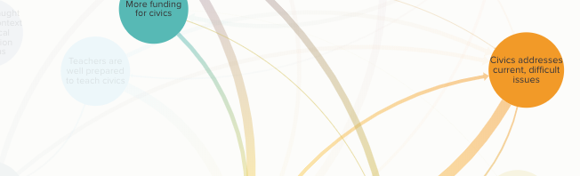
A use case: A colleague noted that his state has chosen civically engaged youth as its goal. The portion of the map shown below presents a subsystem of relevance to him and his colleagues. It suggests that it’s essential for schools to make civic education more of a priority. One (but only one) reason is that schools and systems that care more about civics will allocate more funding specifically for it. There are relationships among youth knowledge of civics, youth civic engagement, and civics that addresses current controversies. In other words, kids learn content and are energized if they address current issues in school. It’s also important that schools be effective and fair institutions, although that may feel beyond the control of the civics field.
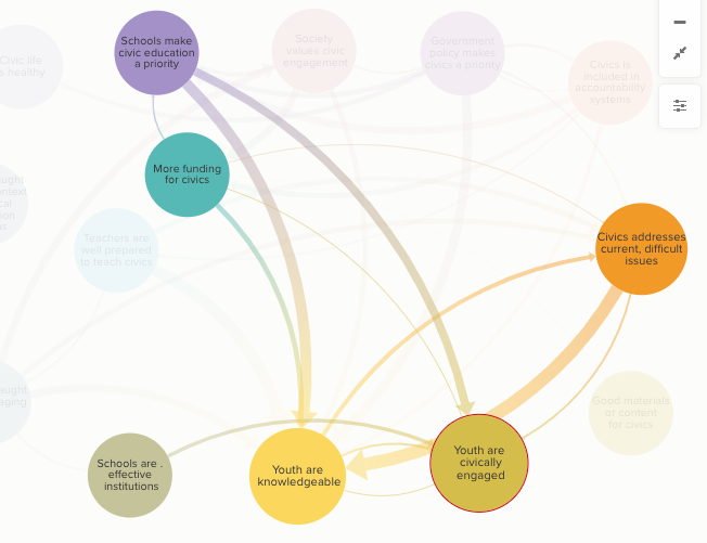
If our colleague wants to know how to encourage schools in his state to embrace their civic mission, he could click on that node (at the top of this illustration) to see its causes in turn.
More generally, the map can be used for:
- Insight: Perhaps it was not already evident that these factors relate in this way. The map may offer insight.
- Diagnosis: The map poses diagnostic questions. How strongly do the schools in your community embrace their civic missions? To what extent do students discuss contested current issues? Do these factors improve as a result of your efforts?
- Support: No self-appointed committee decided that these factors are related in the ways shown above. The diagram emerged from more than 7,500 people’s careful assessments of specific empirical questions. That is a basis for advising relevant decision-makers on how to act.
What if you disagree?
I find myself broadly in sync with this diagram. But what if you don’t see the ideas or connections that matter most to you on the map?
- It’s worth zooming to the more complex map to see if they are there. On that detailed map, you can click buttons to identify all the factors that may be especially relevant if you have a particular take on civic education, such as Action Civics, a social justice orientation, a concern for civil discourse in and out of schools, or a focus on original texts and US history. (Note that these emphases are not mutually exclusive–I happen to endorse them all.) The ideas on the simpler main map are relatively content-neutral, and debates about content appear when you zoom in closer. I think that is appropriate. For instance, if we provide professional development (PD) for civics, then we can discuss what teachers should learn. There will be some healthy debates about that question, as well as some consensus and some room for pluralism and individual choice. But if very little PD is available for civics, then the debate about content is a bit empty. Thus PD goes on the main map, and what teachers should learn is explored on the more detailed map.
- Your focus might be on a different “system,” such as electoral politics or higher ed. Then the disclaimer about our focus on k-12 schools applies.
- You may be right, and the bulk of the 7,500 respondents may be wrong. In that case, the data suggest that you have some persuasion to do, and maybe you should build or publicize a pilot or demonstration program that supports your point. One definition of social entrepreneurship is filling perceived gaps in existing systems. Social entrepreneurship begins by analyzing mainstream views of an existing system (as our map does), identifying gaps, and addressing them.
The method
We first fielded a survey to identify possible causal factors. We recruited 6,495 respondents through a variety of networks. Twenty-one percent of the respondents were k-12 civics teachers; nine percent worked for organizations that address civics; five percent were current k-12 students; two percent were adult civic educators who don’t work in K-12 classrooms; and the sample also included people with many other relationships to civics, including parents who are not teachers, academic experts, funders, and policymakers.
The sample was not demographically representative of youth. Even compared to adult Americans, it tilted whiter (79%) and older (mean age 47)–as do classroom teachers. I acknowledge this as a limitation, but I would add that we never counted the number of votes for any particular idea. We used this survey to brainstorm issues, and it didn’t matter how many people named any given issue. Therefore, the most important question is whether there were significant numbers of young people and people of color to get their issues on the agenda. In fact, 289 people were under age 18, 230 were African American, 262 were Latinx, 122 were Asian, and 78 were Native American.
We used a modified version of the 5 Whys method, first developed by Toyota’s engineers. A core question on our survey was, “Do you think that we provide good enough civic education in the USA today?”
Thirteen percent believed that civics is satisfactory as it is, and they were asked to elaborate. The rest thought that we do not provide adequate civics. They were asked why not: “Now we ask you to think about an underlying cause of that problem. What is an important reason that civics needs improvement?” They gave open-ended responses to that question. Then each respondent was shown his or her own answer and asked to explain that problem. “Now we’d like you to go even deeper. Why is this? Why do you think this happens?” We continued this process until we had more than 12,600 open-ended ideas about the causes of inadequate civics, including 2,800 responses that were five layers “deep.”
As people went deeper, they often began to cite very broad, possibly intractable problems, such as public apathy or an unresponsive political system. Some mentioned political polarization, but more named the left or the right as a harmful influence. The 5 Whys focuses on problems, and pushing respondents four or five levels deep tended to uncover a fair amount of frustration and polarization.
Our next task was to turn these 12,600 responses (including very few precise duplicates) into a much smaller set of factors that would capture the diversity of respondents’ views. Furthermore, we wanted to turn problem statements into levers for positive change. Instead of a list of problems, we wanted a list of specific goals that a coalition could work on.
For example, these are actual statements from the first survey (and there were many more like them):
- “STEM is seen as more important”
- “There is such an emphasis on testing, science and math, that civics is not emphasized enough.”
- “Emphasis on science & math leads to cuts in time for other subjects.”
- “In overemphasizing STEM, we have neglected all the arts (including history and civics).”
We translated all of these ideas into one phrase that summarizes a possible goal: “the number of people who view social studies as just as important as STEM increases.” We also wrote a second goal statement that captured related ideas: “the proportion of adults who believe that stem and civics can go together increases.”
To reduce the full list of 12,600 problem statements to 75 such goal statements, we used a combination of Natural Language Processing (which automatically puts text into clusters) and human coding and judgment. We omitted no original response because we disagreed with it or deemed it beyond the scope of our coalition. For example, someone wrote, “Civic education in most colleges and universities have socialist and marxist educators that use their time to indoctrinate and they do not educate.” Someone else wrote, “Since No Child Left Behind (created by George W. Bush to help his brother Neil’s testing industry biz) our politicians have seen education funding as an opportunity to make money.” We collapsed these comments, and many more like them, into two goals for consideration: “right-wing influence on civics decreases” and “left-wing influence on civics decreases.”
Then we fielded a second survey, drawing mostly on the same respondents. In this survey, respondents were shown 15 pairs of randomly selected possible goals, one pair at time. For each pair, they were asked (in effect) whether A causes B to increase, whether A causes B to decrease, and whether causing B to increase would be a good thing or not. Here is an example of an actual item:
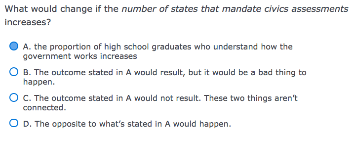 I chose A, but that is a matter of judgment. I could see an argument for C, or even a tenuous case for B or D. If such questions had obvious answers, we wouldn’t need a collaborative process. Our method is to ask multiple people to share their best judgment about pairings like this one, based on their own experience.
If 75 factors can be linked to one another in either direction (A causes B and/or B causes A), there are 10,100 possible links. We recruited 1,825 people to take this survey (of whom 1,057 had also taken the first one). Each pair of nodes was reviewed at least three times and sometimes more than ten times. Once a link had been reviewed many times, we deleted it from the survey to channel responses to the pairs that had been randomly overlooked so far.
We treated a possible link as actual if 90% of the raters or at least 9 raters considered it a positive causal link. About 80% of the possible edges had some support as real causal connections; and 18% reached the 90% threshold. This produced a map that is too complex to guide action, although it’s perhaps an accurate reflection of the actual topic. It is the map shown here.
To simplify it, we clustered the 75 nodes conceptually. Two raters compared schemata and resolved differences to produce 14 nodes for the main map. We also asked 12 representatives of state education agencies gathered at a meeting to make their own clusterings and used their ideas to inform us. The best measure of inter-rater reliability when you have many raters and open-ended codes is Krippendorff’s alpha, which was fairly low, but that appears to be because many of the state representatives did not get around to categorizing most of the 75 ideas at all. There is certainly some subjectivity involved in our clustering, but we are transparent about the components of each cluster.
The maps also indicate which ideas were controversial, in the sense that some people thought these outcomes would be bad. The rate of controversy was never high–usually under 5%. However, this may be an underestimate, because if raters saw no causal link at all between two nodes, they couldn’t indicate that either of the nodes was bad.