- Facebook112
- Threads
- Bluesky
- Total 112
On the 50th anniversary of the War on Poverty, I recommend playing with the New York Times’ remarkable zoomable map. Click on both views: the percentage and the number of people who are poor, because they tell different stories.
I do have some questions about accuracy or validity. For instance, this is my hometown of Syracuse, NY. Almost all of it is at least 30% poor, which I am sure is true. The Census tract in which I grew up is outlined. More than two-thirds of the residents of that tract are considered in poverty. That is a high rate. Philadelphia’s poverty rate is 26.7%, and Baltimore’s is 24.5%. I cannot find any Census tract inside Baltimore City that matches the poverty rate of my home neighborhood. And the tract just to the west of ours is even worse, at 82.4% poor.
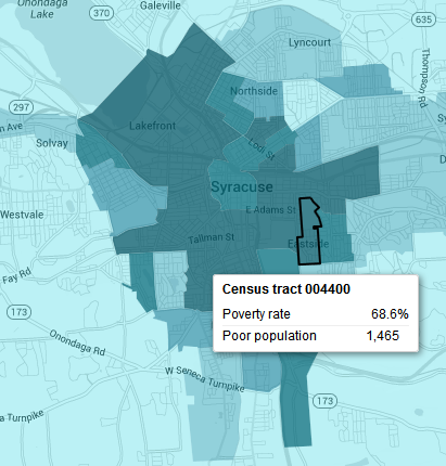
But that tract includes Syracuse University and its student housing. Even granting that SU is in a poor area of a highly stressed, post-industrial city, I find it misleading that these two tracts are poorer than anywhere in Baltimore or Philadelphia. I suspect that students are missing from the Census data, and that is one of several sources of error. Another possibility is that the Census tract is actually too large a unit to be fully meaningful. Several of the Syracuse tracts bridge quite different neighborhoods.
Still, as you zoom outward, a powerful picture of US poverty emerges.